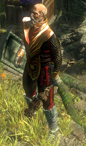
any character animations you think should be improved?
|
Witch runs a slight bit like shes got "stick up butt" syndrome.
|
|
|
Not really character animations but staves seem too big (too thick to be precise), with the exception of Taryn's Shiver, for female characters.
|
|
|
The only animation in the game that really rubs me the wrong way is the Templar's run animation. I can't unsee his chest waving around, please give the whole thing a polish. Nothing else comes to mind.
Ruby light of Songbird dreaming,
Daring King of Swords deceiving, Queen of Sirens left in grieving, Star of Wraeclast evermore. |
|
|
templar holding 1h weapons
Spoiler
 edit: did you change templar's leap slam animation or smth? Last edited by ShinningWizard#3959 on Jun 6, 2015, 12:34:26 AM
|
|
" On this note, the witch holds some of the staves far too low on the character while she runs. It looks goofy and unbalanced, magicians should be holding their staves halfway up, not at the bottom third while the other two thirds wobble on the other end of their hands. |
|
|
I find my witch's cast animation while holding a staff a little silly looking when I get higher cast speed. Something about how much the staff wiggles at high speed while I've got vaal haste going.
|
|
|
Templar walks like a girl!
|
|
|
Portal gem animation for templar - and probably for other classes as well
|
|
|
The templar wobbles a lot when he walks. This looks absolutely ridiculous when you put any back attachment on him, like the Hussar wings or the banners from the last supporter packs.
|
|
|
FINALLY. I'm so ridiculously happy something about animations is going to happen.
I really dislike most of the walking animations; the look stiff and not really appealing to me apart from the scion. The Shadow has really weird buff/totem animations. Also various animations for other characters seem rather weird (templar channeling flameblast) . I'd suggest using a more standard casting animation to make it look better. Another big subject for me is the really fast casting and attacking animations with spell echo and multistrike seem just really out of place for my taste and ridiculous. I'd consider them really immersionbreaking. And at last I'd appreciate a wider variety of animations than currently available so i'd feel better in general. ------------- ART Off-topic: Traps look really bad in my opinion. And since when are traps thrown? This kind of bothers me. Maybe change them into bombs? |
|


