My Haku Hideout (A work in progress)
|
I have been working on my Haku hideout for a while now, and I really like the general layout that I have created, as well as a few specific design choices that I have made. That being said, much of it is still unfinished, and I don't know what to do, so I was hoping to show it off and hear some constructive criticism and ideas.
I'm trying to get as much of the hideout as possible into a few screenshots, so the angles are going to be a little weird, but I can always post more pics later. I'll start with the waypoint area. My hideout makes use of a ridge of large rocks running through the middle tier, ending at the waypoint. I found that the best way to blend the rocks in with the waypoint area was to lay an animal skin rug and some trash on top of it. I then added fetid smog and wisps to make the area glow a bit. I had to tweak this area for a while, but I'm fairly happy with it now. I also reskinned my stash with a chest to give it a cool new look. 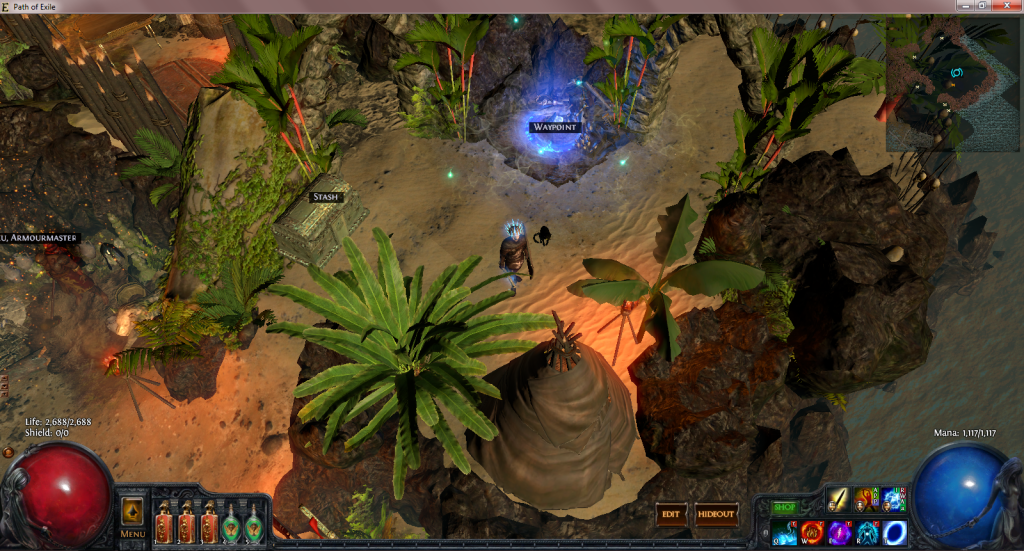 Here is Elreon's area. This is actually a sort of general purpose master area that anyone except Catarina could occupy. I am also fairly happy with this area, but it could use a few more decorations, and a bit of tweaking on the placement of existing decorations. 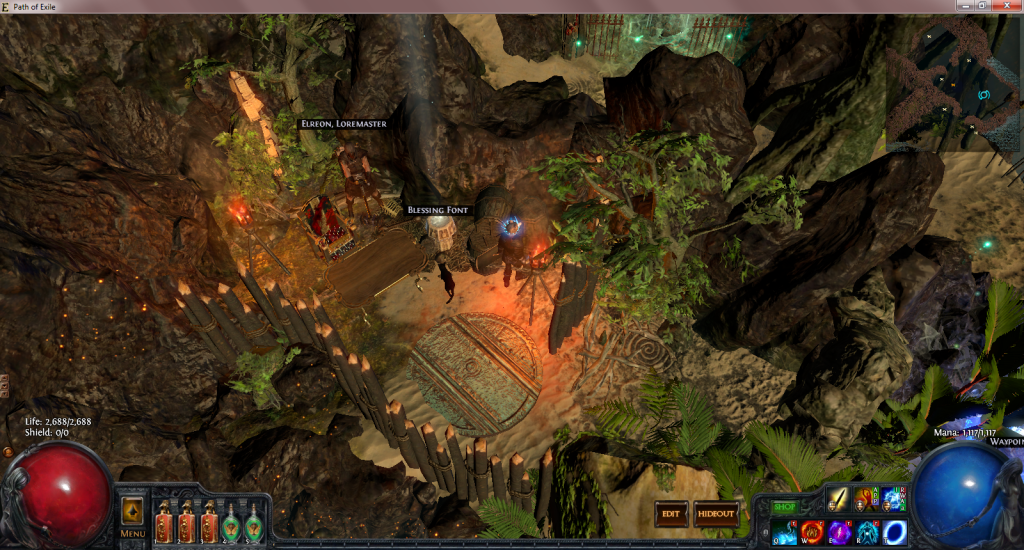 At the top of the last screenshot, you can see a bit of Catarina's area. Here is a closeup of her area. I gave her a damp, mossy space to cast her green glow on. There are layers of fetid smog, tons of flies, (Which aren't very visible in the screenshot.) corrupted specks, slugs, wisps, and rain. I like this area a lot. 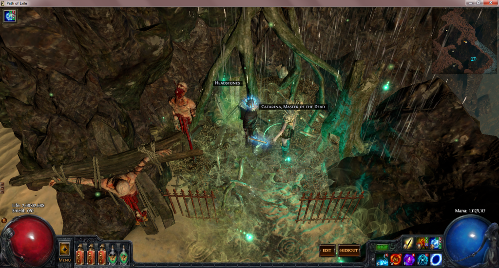 The upper tier is a very unfinished area. The highlight of this area is the map machine, which I like very much, but pretty much everything else could be changed or added to. For the map machine, I used Grigor's walls, a well, a fire pit and a path from Tora. I think it looks great with the orange portal effect. Note the impaling spike hidden inside the church wall. It would be nice to have more spikes, but they would all have to look identical, since every other variation of the spike shows bodies cast into the stone rather than on top of it. I may replace the church wall with a palisade fence, but I kind of like the worn away stone look. It's just difficult to blend in the segments of wall, and the wall may be a little out of place in the hideout. Thoughts? 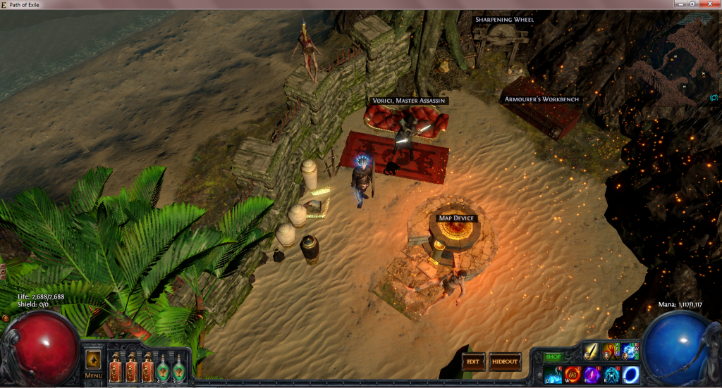 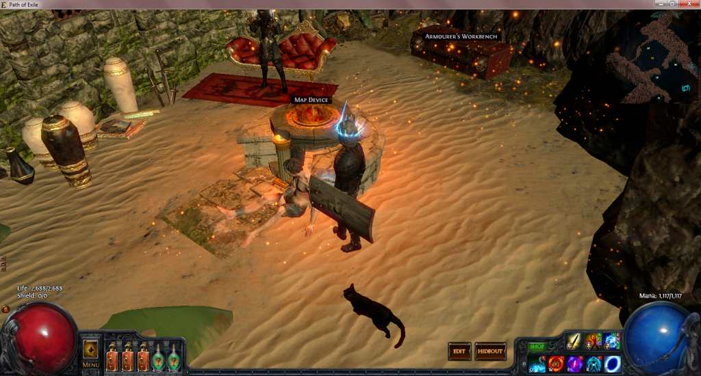 Lastly there is the lower tier, which currently has ample space for decorations. By the walkway, I set up a little place for Tora, but I currently have Haku in her place. The rhoa's nest area isn't that great, but the rug and prayer stones and lion statue are nice. To the left of the area is a crafting bench and some Oriath crates, as well as my reskinned guild chest. I suppose I could do something to separate the two themes? 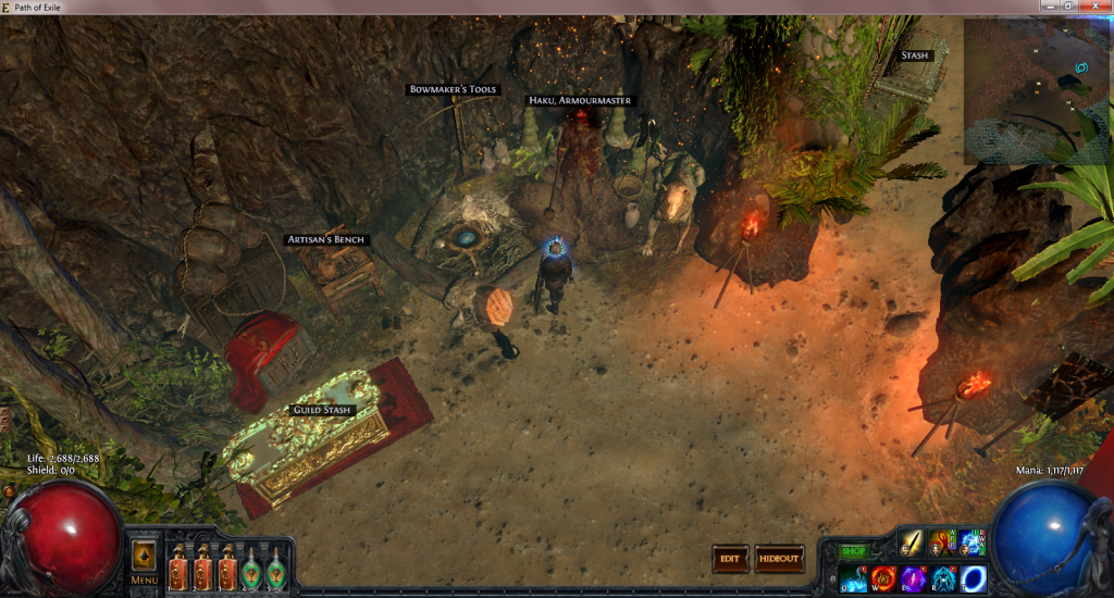 At the bottom, I have placed a large pile of corpses with an energy dome on top. I liked the energy dome decoration enough to buy it, but I've found that it's difficult to decorate with due to its size. This was the best I could do with it. (Note the wisps and glowing embers.) Also in the picture is a pile of shipwreck treasure and a chest. I thought this was the perfect decoration for the ship. 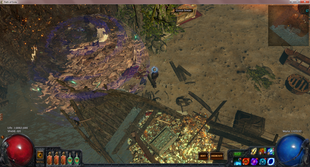 Finally, there is a large area that is currently wide open space with a few pieces of rusty machinery laying around. Once I level up Vorici, I intend to decorate with a small prison for exiles. Any thoughts on this? At the top of the screenshot, you can see a little area where I've placed banners. I think the red banner goes perfectly in that spot. Leo may be kicked out soon. I don't know if I even want him in my hideout. 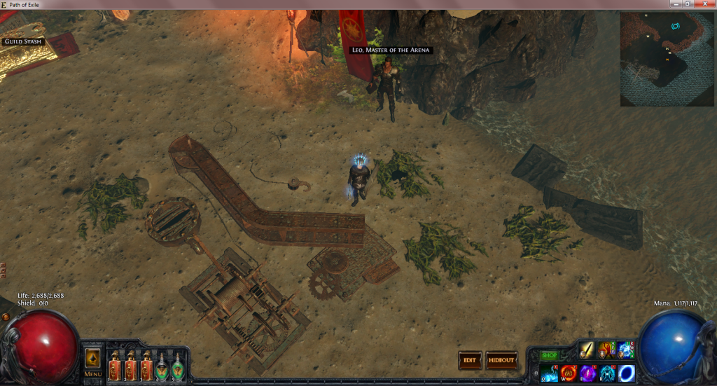 So that's as much as I'm sharing right now. I can post more screenshots later. If you've read through all of this, thank you for taking the time to check it out, and I welcome your feedback, as long as it is constructive. |
|


