New Microtransactions
|
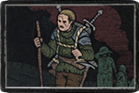
Darprism armour set is one ugly madafaka.
| |
|
HAHAHA, Darkprism Armour Set like, OMG I CAN'T EVEN, HAHAHA, Jesus F Christ...
[Removed by Support] Wow, I never thought I'd see the day. Through the years I've seen some "meh" designs or some designs that I'm just not interested in. I don't even comment on the ones I buy and it's not like I haven't bought a boatload of them. But this thing... this thing is just so butt f*ck ugly, it's downright disgusting. I mean... How can you create something so beautiful as the Grand Sanctum armor and in the same league release what is quite possibly the ugliest piece of **** I have ever seen in this game. I don't know, might sound a little too harsh but the quality of the recent MTXs is kinda underwhelming (and this Darkprism Armour is the absolute low). Combine that with the somewhat disappointing Core packs, the really crappy idea of selling in-game zones as hideouts which are smaller than the crafting table... I don't like where this is going. Last edited by Matthew_GGG on Jan 17, 2020, 6:58:34 AM
| |
|
It's pretty well done, I would'nt say it's ugly but pretty pretty weird.
Interesting anyway. |

|
|
Stop making wings...be more creative...
| |
|
something about this feels like a deep sea scuba diving rig
like there is something neat about it but at the same time makes no sense at all - like the rotating rings that seem mechanical but are wedged into the armor so they are not floating they are just rotating and grinding into the chest or some shit fucking weird just looks like some eccentric nonsense I would see on project runway the portal is pretty cool ✰CARD✰ The Survivalist I can’t buy any more big supporter packs because the forum only supports showing 7 legacy tags. Last edited by cgexile on Jan 17, 2020, 8:35:09 AM
| |
|
Boy I sure hope whoever designed this isn't reworking mtx armors for poe2 or were will get the ugliest remakes/remodels ever. I though Harbinger supporter armor looked bad but this takes the cake.
It's so visible that the portal was designed by someone completely different then the armor set. Since the portal actually looks good while the armor set looks like my kids drawing of an astronaut. Did you even look at the set its not even proportional and even in the video the templars left shoulder is clipping inside while the right one is sticking out. Don't even need to mention the boots on how ugly they look and don't fit on the set. The golden circles on the shoulders of every class is clipping with the small sticks in the shoulders also. I feel like the more I look at the pictures of the video the more clipping I see Its obvious that the design team if full of them self and are boosting their ego saying that this is epic work to each other and not taking anyone else opinions.You see this happening to bands all the time they put out 1 good single then think they are gods until they run out of money and can't even afford to record in a studio. Last edited by ArthasMenethrill on Jan 17, 2020, 8:58:50 AM
|

|
|
horribly horrifying.
hardcore casual.
Playing PoE for years and having fun despite GGG. |

|
|
AHAHAHA WHATAFACK
 [Removed by Support]
| |
|
Darkprism is such a fabolous looking armour, dem yoga pants looking thiiight!
|

|
|
I like when designs try to push the envelope. Sometimes it works and sometimes it doesn’t.
This didn’t work, for me. The top and bottom don’t match. It would be better if there was coherence in the design. As some have said the portal is gorgeous though, and I wish the armour followed that aesthetic. I hope the designers keep trying and don’t just play it safe in the future. |

|